How to create a house filled with natural light, appeasing, and thought with the day-to-day life in mind? It had to extend the house and preserve the quality of the garden while working around the various zoning bylaws. Two glass and wood volumes were added to the original home, making room for the extended family. The box placed in the garden serves as a playroom for the children, while the other box shelters the master bedroom and is located on top of the building. Really unique design and eye-catching right, mate?
Bright and Fresh Family House Design Surrounding Mountain Ranges
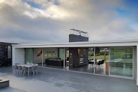
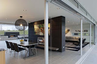
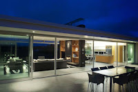
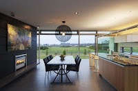
This house constructed by Stapleton Elliot Design Group. The residence is an uncluttered weekend retreat, featuring three pavilions positioned around an enclosed and sheltered courtyard. At each end of the house, there are private spaces that shelter the master bedroom and guest rooms. The central pavilion accommodates entertaining and living spaces, perfect for the family get-togethers. The architects describe the house as a space filled with light: “The emphasis of the design is to merge both house and site to provide views to the surrounding mountain ranges, rural horizons and to capture both morning sunrise and late afternoon sun. Considered attention to detailing is inherent throughout, complimented by furniture and artwork that connects inside space with outdoor enclosures to create a private and relaxed retreat.
Labels:
Decorating,
Design Gallery,
Home Interior Design,
House Design
Modern Residence that Have Unusual Perspectives and a Refined Modern Design
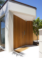
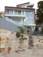
The building site offered some major challenges for the architects. Stretching from the street edge 420 square meters East, the site in sot leveled, but drops vertically towards the harbor. The client brief was for a three bedroom house with the living area at the lowest level to best utilize the outdoor garden space. As the entry to the dwelling was on the third story (at street level) it was necessary to design the building to provide a sense of arrival and to clearly define the unusual entry sequence. A four story void scallops out the building to unify all the levels and provides the sense of arrival at the top level. The void is expressed on the exterior of the building as a tapering blade that grows through the otherwise rectilinear building form. The primary views are to the north-east so that the entire house plan skews northwards to allow bedroom and living areas to enjoy this aspect to further animate the building form. The interiors present unusual perspectives and a refined modern design.
Labels:
Design Gallery,
Home Interior Design,
House Design
Subscribe to:
Comments (Atom)


